How to add a button to the mobile header
****See Updated Tutorial****
This tutorial will show you how to add a button to a mobile header which already has a button displayed on the desktop navigational menu. This will work for Squarespace 7.1
In today's digital world, where most users access the internet via smartphones, it is essential to create a website that is mobile-friendly. This blog post will explore how to incorporate a button into the mobile header of your Squarespace website, positioned between the logo and the menu icon. This approach can be beneficial for placing a call-to-action button in the most prominent area of your site or providing an alternative way to navigate your pages. Additionally, we'll cover important factors to consider when adding a button to your mobile header, such as size, color, and text. Whether you are a developer seeking to improve your skills or a website owner looking to enhance your mobile website's functionality, this guide will equip you with the necessary knowledge to add a button to your Squarespace website's mobile header.
Complexity: Easy
Step 1
Code 1 - variation
Add the following CSS, go to ‘Pages > Custom Code > Custom CSS’. Copy and paste the code into the Custom CSS editor box.
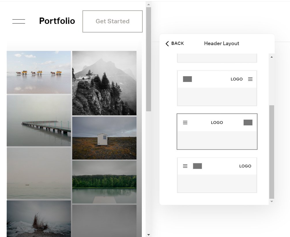
The CCS code below works for the following menu variation.
/* Show button on mobile menu*/
// Mobile Menu Button
@media screen and (max-width:992px) {
/* show button */
.header-actions {
    display: block !important;
}
.header .header-actions-action--cta {
    display: block;
    position: relative;
    width: 10% !important;
}
/* logo width */
.header-title-nav-wrapper {
   flex: 1 0 calc(~"100% - 150px") !important;
}
}

Menu variation one
Step 2
Code 2 - variation
The CCS code below works for the following menu variation.
/* Show button on mobile menu*/
// Mobile Menu Button
@media screen and (max-width:992px) {
/* show button */
.header-actions {
    display: block !important;
}
.header .header-actions-action--cta {
    display: block;
    position: relative;
	left: -25px;
}
/* logo width */
.header-title-nav-wrapper {
   flex: 1 0 calc(~"100% - 150px") !important;
}
}
Adjust the left value to suit.
left: -25px;

Menu variation two

Menu variation three
Step 3
Code 3 - variation
The CCS code below works for the following menu variation.
/* Show button on mobile menu*/
// Mobile Menu Button
@media screen and (max-width:992px) {
/* show button */
.header-actions {
    display: block !important;
}
.header .header-actions-action--cta {
    display: block;
    position: relative;
	left: -70px;
}
/* logo width */
.header-title-nav-wrapper {
   flex: 1 0 calc(~"100% - 150px") !important;
}
}
Adjust the left value to suit.
left: -70px;
Menu variation four
Step 4
Code 4 - variation
The CCS code below works for the following menu variation.
/* Show button on mobile menu*/
// Mobile Menu Button
@media screen and (max-width:992px) {
/* show button */
.header-actions {
    display: block !important;
}
.header .header-actions-action--cta {
    display: block;
    position: relative;
	left: -90px;
}
/* logo width */
.header-title-nav-wrapper {
   flex: 1 0 calc(~"100% - 150px") !important;
}
}
Adjust the left value to suit.
left: -90px;

Menu variation five
Step 5
To remove the button from the mobile menu, add the code below.
// Removal of button from the mobile menu
.header-menu-cta{
  display:none;
  }
If you have any questions or need any help with your Squarespace website design, you can book a 1:1 consultation.
All work in this guide is provided ‘as-is’. Other than as provided in this agreement, this guide makes no other warranties, expressed or implied, and hereby disclaims all implied warranties, including any warranty of fitness for a particular purpose.
If you require professional advice, we recommend that you purchase the services of a developer.
