How to convert your desktop navigation to a mobile navigation in Squarespace 7.1
In Squarespace 7.1, your site’s navigation is responsive by default—meaning it adjusts based on screen size. However, there may be situations where you want your desktop navigation to look and behave like the mobile menu, such as simplifying a cluttered header or creating a consistent experience across devices.
This tutorial will guide you through how to force the mobile (hamburger) menu to display on desktop using a simple CSS snippet. This can help declutter your design, especially if your navigation has many links or you're aiming for a minimalist aesthetic. This solution is credited to tuanphan.
Table of Contents
Why Use the Mobile Navigation on Desktop?
Here are a few reasons you might want to show the mobile menu on larger screens:
You want a cleaner, more minimal look
You have too many menu items for a horizontal layout
You want consistency across mobile and desktop views
Your branding calls for a hamburger-style menu regardless of device
Complexity: Easy
Step-by-Step Instructions
Step 1: From the Squarespace dashboard navigate to Pages > Custom Code > Custom CSS and paste the code below into the Custom CSS editor box.
@media screen and (min-width:768px) {
 /* hide  header navigation */
    .header-nav {
    display: none;
}
/* Hide header buttons */
.header-actions {
    display: none;
}
/* show burger  menu*/
.header-burger {
  display: flex;
}
/* Show overlay mobile menu */
.header--menu-open .header-menu {
opacity: 1;
visibility: visible;
}
}
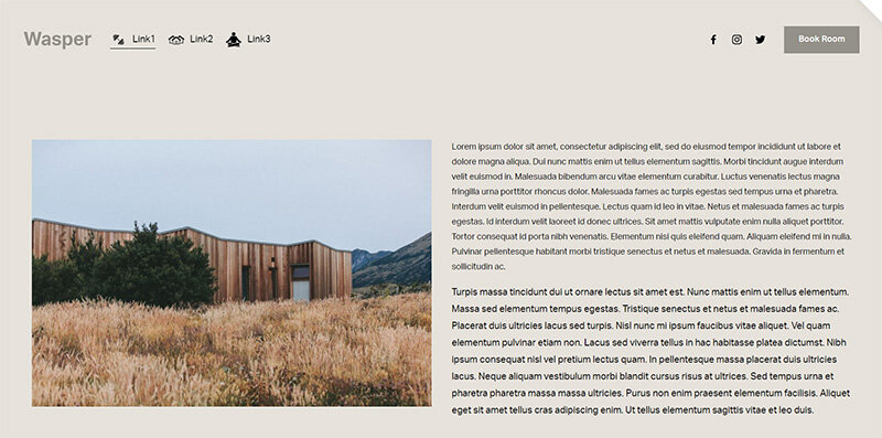
Desktop menu
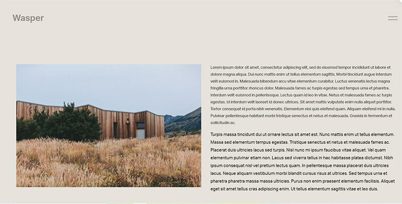
Mobile menu
Key Takeaways
Squarespace 7.1 automatically adjusts navigation based on screen size
You can force mobile navigation to display on desktop using custom CSS
This can simplify complex headers and create a more unified user experience
Styling is fully customizable with CSS for a seamless look
FAQs
Will this affect my mobile navigation?
No. Your mobile navigation will continue to work as expected. This CSS only forces the mobile version to appear on larger screens.
Can I still style the desktop header area separately?
Yes! You can target header elements with CSS and style them differently, even when showing the mobile menu.
Will this work with all Squarespace 7.1 templates?
Yes. All Squarespace 7.1 templates share the same underlying structure, so this solution is universally applicable.
Conclusion
Turning your desktop navigation into a mobile-style hamburger menu can be a smart move for sites that value simplicity and focus. With just a few lines of CSS, you can transform your site's navigation into a cleaner, more modern experience.
If you have any questions or need any help with your Squarespace website design, you can book a 1:1 consultation.
All work in this guide is provided ‘as-is’. Other than as provided this guide makes no other warranties, expressed or implied, and hereby disclaims all implied warranties, including any warranty of fitness for a particular purpose.
If you require professional advice, you can book our consultation services.
