How to customise the style of the product quick view lightbox
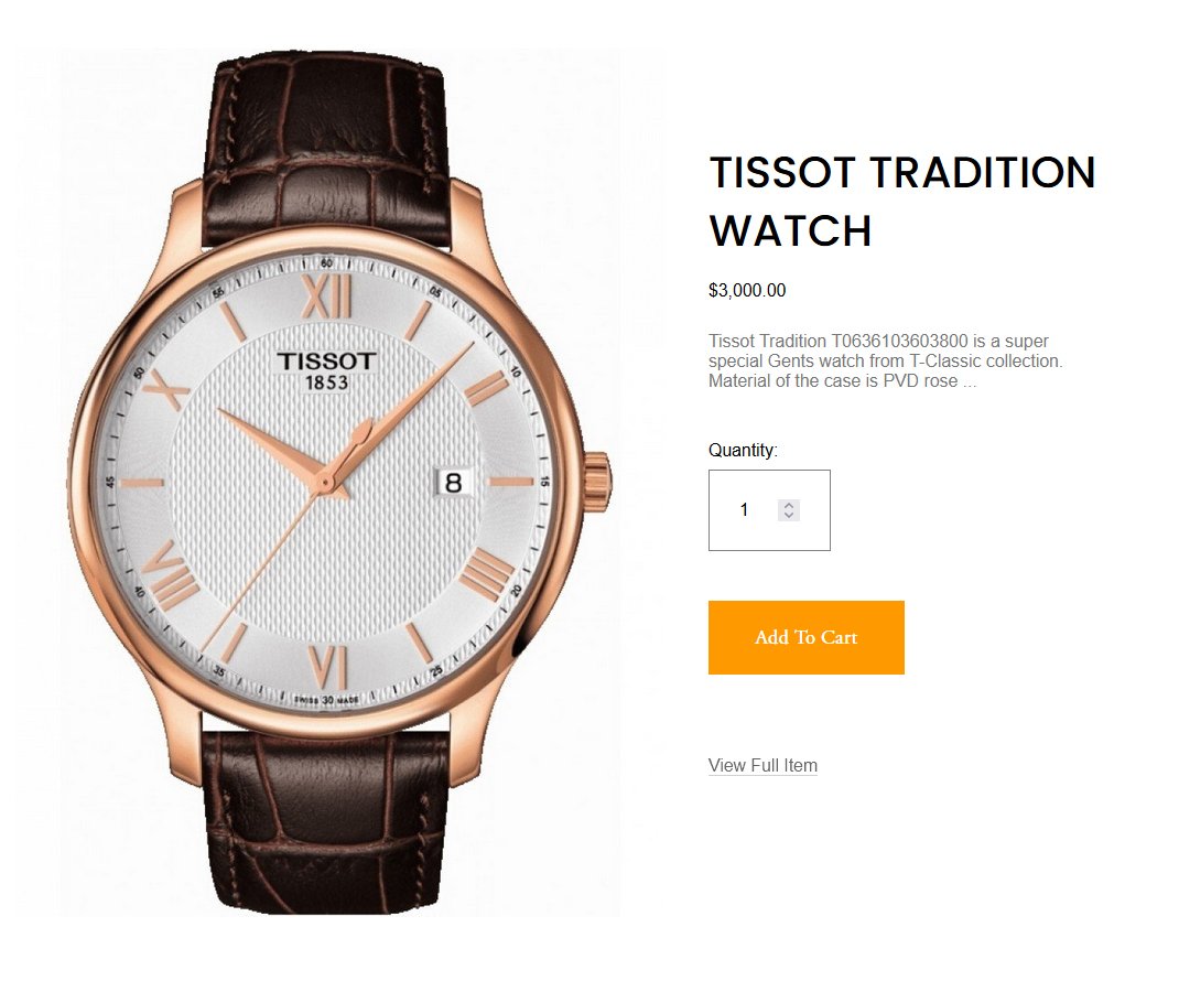
Squarespace's Product Quick View feature is a convenient way for customers to preview product details without leaving the page. But by default, the lightbox modal that appears may not fully match your brand’s aesthetic.
In this tutorial, you’ll learn how to customise the appearance of the Product Quick View lightbox using CSS — from adjusting the background color and fonts, to styling the button, text, and layout spacing.
This code will work on Squarespace 7.1.
Table of Contents
Why Customise the Quick View Lightbox?
Brand consistency – match your brand’s fonts, colors, and buttons
Improve usability – make content easier to read and navigate
Create focus – reduce clutter or enhance specific elements
Complexity: Easy
Step-by-Step Instructions
Step 1
To add a shadow to the quick product lightbox, simply go to Pages > Custom Code > Custom CSS and copy and paste the code below.
.sqs-product-quick-view-content {box-shadow: 5px 5px 15px rgba(0,0,0,0.2)}

Step 2
To add a border to the quick product lightbox, go to Pages > Custom Code > Custom CSS and copy and paste the code below.
.sqs-product-quick-view-content {border: 1px solid purple; }

Step 3
To change the background colour of the quickview product lightbox, go to Pages > Custom Code > Custom CSS and copy and paste the code below.
.sqs-product-quick-view-content {background:#f90}

Step 4
To change the ‘Add to Cart’ button colour of the quickview product lightbox, simply go to Pages > Custom Code > Custom CSS and copy and paste the code below.
.sqs-product-quick-view-content .sqs-add-to-cart-button {background-color:#f90 !important}
Step 5
To change the colour of the close X button colour inside the quick view product lightbox window, go to Pages > Custom Code > Custom CSS and copy and paste the code below.
.sqs-product-quick-view-lightbox-close-button line{stroke:#f90 !important}

Step 6
To change the colour of the overlay that shows up behind the background inside the quick view product lightbox window, simply go to Pages > Custom Code > Custom CSS and copy and paste the code below.
.sqs-product-quick-view-lightbox.sqs-modal-lightbox .sqs-modal-lightbox-content .lightbox-background {background:#f90 !important; opacity:0.6}

Key Takeaways
You can change the background, text, button, and layout spacing using CSS.
Elements like the title, price, and variants can be styled individually with their own selectors.
FAQs
Can I hide the "Add to Cart" button in Quick View?
Yes.
Can I reposition the product image or description?
Squarespace doesn’t allow direct layout changes without JavaScript, but you can adjust spacing, padding, and margins.
Conclusion
Customising the Quick View Lightbox in Squarespace is a great way to enhance your site’s professionalism and ensure a cohesive shopping experience. With just a few lines of CSS, you can completely transform the look and feel of your product previews—giving your store a polished, branded appearance that customers will trust.
If you have any questions or need any help with your Squarespace website design, you can book a 1:1 consultation.
All work in this guide is provided ‘as-is’. Other than as provided in this agreement, this guide makes no other warranties, expressed or implied, and hereby disclaims all implied warranties, including any warranty of fitness for a particular purpose.
If you require professional advice, we recommend that you purchase the services of a developer.
