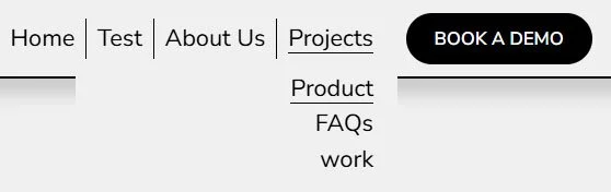
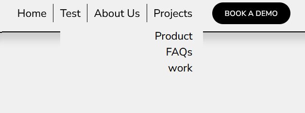
How to remove underline from dropdown menu in Squarespace 7.1
By default, Squarespace 7.1 applies underlines to links in your site’s header and dropdown menus—especially when hovered or active. While this can help indicate clickable elements, many site owners prefer a cleaner, more modern look without the underline, especially in dropdown menus.
In this tutorial, we’ll walk you through how to remove underlines from dropdown menu items using simple custom CSS—giving you full control over your site's navigation styling.
Table of Contents
Why Remove Underlines from Dropdown Menus?
To create a cleaner, minimalist look
To better align with your brand’s design aesthetic
To remove default styling that feels outdated or distracting
To differentiate dropdown links from other navigation items
Complexity: Easy
Step-by-Step Instructions
Step 1
Copy the code below and from the Squarespace dashboard navigate to Pages > Custom Code > Custom CSS and paste the code.
// Remove underline dropdown menu title
div.header-nav-item--active span.header-nav-folder-title-text {
    background-image: none !important;
}

// Remove underline dropdown menu Content
 .header-nav-item .header-nav-folder-item--active .header-nav-folder-item-content {
    background-image: none !important;
}
Key Takeaways
Squarespace automatically underlines dropdown links, but you can remove it with CSS
Use
.header-nav-folder-content ato target all dropdown linksAdd
!importantto override built-in theme stylesCustomize hover behavior for cleaner user experience
FAQs
Will this affect my mobile menu?
No. The dropdown styling here targets the desktop navigation. Mobile menus use different class names.
Can I keep underlines on top-level nav items, but remove them from dropdowns only?
Yes! The code above targets only dropdown (folder-content) links. Top-level links use a different class and won’t be affected.
Can I add hover animations instead of underlines?
Absolutely! You can use color fades, scaling, or underline transitions. Example: .header-nav-folder-content a:hover { color: #ff5500; transition: color 0.3s ease; }
Conclusion
Customizing the appearance of “Read More” links is a quick and easy way to refine your blog layout and match your brand’s design. With just a bit of CSS, you can remove underlines, adjust hover effects, or even add icons for a more engaging and stylish blog experience.
If you have any questions or need any help with your Squarespace website design, you can book a 1:1 consultation.
All work in this guide is provided ‘as-is’. Other than as provided in this agreement, this guide makes no other warranties, expressed or implied, and hereby disclaims all implied warranties, including any warranty of fitness for a particular purpose.
If you require professional advice, we recommend that you purchase the services of a developer.


